We are currently in the midst of a large branding project. It started with an analysis of the client’s competitors and target audience and is now in the final stages of logo development and refinement and the beginning phases of the web site design.
As we are refining the logo design, we’ve had some interesting conversations about “What is the best shape for a logo?” And “Is it OK to have multiple versions of your logo?” such as one that is predominantly horizontal and another that is grouped more compactly.
I’m not ready to share the client’s in-progress work, so I will use other examples to illustrate my point.
The wide rectangle
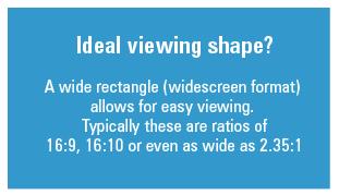
When I was in design school, we were taught that the ideal shape for a logo is a horizontal rectangle. That doesn’t mean that the actual shape of the logo needs to be a rectangle, but the live area should be like a wide rectangle.
An example of a logo we created that fits the wide proportion, but is not actually a rectangle shape.
This is the normal viewing area for the human eyes, which is why they use it in movie theaters. This format is now becoming more mainstream as TVs and computer monitors are also more commonly created with this widescreen format. That shape can quickly and easily be seen, whereas a more tall & skinny or overly wide format may take longer for the human eye to see and recognize the information.
The square
Nowadays, there are many applications that require a square version of your logo. Favicons, and avatars are two common places where you may need to represent your company or brand with a small, square version of your logo. Some designers are trying to create logos that are specifically square to start with. Other shapes that fit within a square would be a close second choice, such as circles or triangles. They should have the same height and width dimension.
A logo with a square shape as the live area (although it’s actually a circle)
Working with your business name
A critical problem (and one for this client project we’re in the middle of) is businesses with long names. In that case, it can be difficult to make a version of the logo that is grouped tightly. If you’re starting from scratch, you may want to consider a short name. There are many benefits to a short and snappy name and one of them is that you’re able to create a very compact logo design.With a name like Visible Logic I understand the issues!One company that overcame this issue was FedEx. For years, they fought to be called their full name: Federal Express. But eventually they decided to change to the nickname that everyone was using: FedEx. This opened up a world of opportunity when they rebranded. What started as a weak logo, was redesigned and is now praised as one of the best.
You can see with the FedEx example, that choosing a short brand name can be beneficial. But, it is not the only consideration. The name needs to make sense to people, it needs to have an available domain name, etc. You also may have a company that has successfully been in business for a long time and it doesn’t make sense to shorten your name! (You probably don’t have FedEx’s budget for marketing, nor their promotional opportunities on the sides of trucks and planes across the globe).Should you have more than one version of your logo?
Harkening back to design school days again, I remember being told that while a wide rectangle is the ideal shape for a logo, you should always have a version that can fit on the side of a pen. Pens are frequent giveaway items at trade shows and some businesses do rely on this type of promotional item. Nowadays, it’s more common to need a horizontal version within a web site banner or header.
It is reasonable to have more than one version of your logo. You probably already have more than one version— such as a full color version and a black and white or one color version. With careful planning, you should be able to create several, tightly related versions of your logo so that you always have the best fit for the application at hand. Here is an example of both a wide and stacked version of British Airways logo (note there is also no highlight on one version, which might be necessary depending on the application).
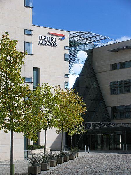
Looking around on the web I was also able to find a
picture of the British Airways headquarters that had the stacked version, but with white type.
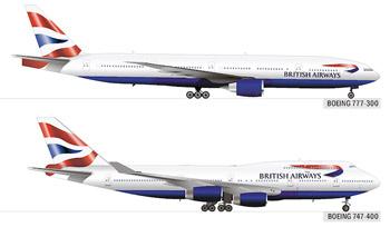
On this page you can see a complete run down of all their planes with the logo applied. It is always the horizontal logo, but the actual placement of the ribbon graphic and the size and relationship between the graphic and type changes based on the physical structure of the plane.
Click here to see British Airway’s fleet and how the logo changes slightly on each
plane.
6 Tips for logo usage
- The fewer the variations, the better. It is still ideal to have one version of your logo and be able to apply it in every case. This is the easiest way (especially for a small business owner) to ensure the correct usage and maximum impact.
- But… make sure you have different versions that present your brand in the best light. Just like you have different color versions, based on ouput, you may need to have different lockups (the groupings of the typography and graphic). For example, if you only have a circular version of your logo, and you have a wide rectangular space to work with, your logo will appear very small. This is probably not ideal in a place where you are trying to maximize exposure. Having a secondary, wider version is good.
- Consider the applications that are critical to your business. For someone like British Airways, a wide logo is great for placement on their planes. If you give away a lot of pens make sure you also have a good horizontal version of your logo. Think about the applications for your logo: large scale signage, uniforms, business cards, etc.
- Create masters and then stick with it. Try not to make too many variations of your logo. This will weaken your identity. Ideally, have your designer create a complete logo library that includes things like: color version, black and white version, square avatars and logos with and without the tagline.
- Prioritize your logo options. It’s best to consider one version of the logo to be the “master” and then the rest are secondary versions. The master has the ideal grouping of type and icon and is in your corporate colors. Always attempt to use the master first.
- Make sure people understand the importance of consistency. Whether it’s the business owner, the marketing department personnel, or your web site designer, make sure the people who apply your logo have access to the right files and understand which version is the best to use.
+ إنشاء موضوع جديد
النتائج 1 إلى 1 من 1
الموضوع: What Is The Best Shape for a Logo?
-
25-12-2015, 06:55 #1Status
- Offline


- تاريخ التسجيل
- Apr 2014
- الدولة
- Egypt
- المشاركات
- 4,679
 Engineering and Technology
- معدل تقييم المستوى
- 10
 What Is The Best Shape for a Logo?
------------------------------------------------------------------------
شركة رايز للهندسة و التكنولوجيا Rise Company for Engineering & Technology
------------------------------------------------------------------------
Web Hosting | Web Designing | E-Marketing
رقم # 1 فى خدمات الشركات Business Services
استضافة مواقع Web Hosting - عمل ايميل شركة Business Emails
تصميم موقع شركة Web Design - تسويق الكترونى على جوجل Google Adwords
www.rise.company | www.rise.company/emails
ملحوظة : جميع خدماتنا مخصصة للشركات فقط وغير متاحة للافراد
وليس لنا اى منتجات او صيانة نهائيا! يرجى الانتباه الى ذلك.
المواضيع المتشابهه
-
Chairs { distinctive shape
بواسطة Eng Amr Adel في المنتدى قسم أدم و حواءمشاركات: 0آخر مشاركة: 07-12-2009, 16:47


 رد مع اقتباس
المفضلات