


ووردبريس Wordpress عكس الترتيب على الموبايل Reverse column stacking order
Columns ordering on devices - WP Bakery Column Stacking / Display Order
swap columns in visual composer on mobile responsive
Stacking Columns Problems When Using WP Bakery Builder
Add display:flex to your row and then, with media queries, in mobile add flex-direction:column-reverse to the same row. It will reverse the column order and so the one that is on right in desktop will move up, and the one on the left will move down.
display:flex you can add it before mobile ( in general styles ) or just in mobile version when you need to add also flex-direction:column-reverse
See example below or jsfiddle
اوكود:@media handheld, only screen and (max-width: 767px){ .vc_row.element-row.row { position: relative; flex-direction: column-reverse; display: flex; } }
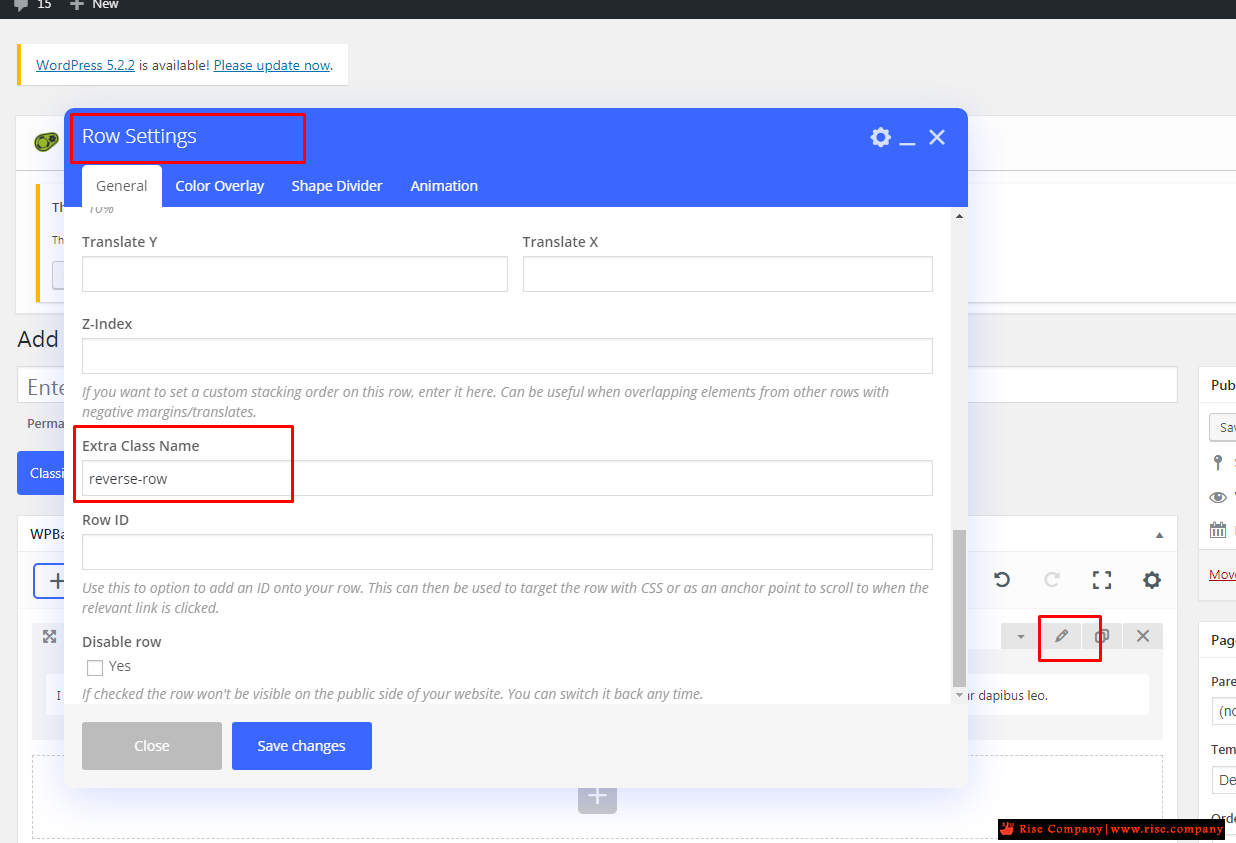
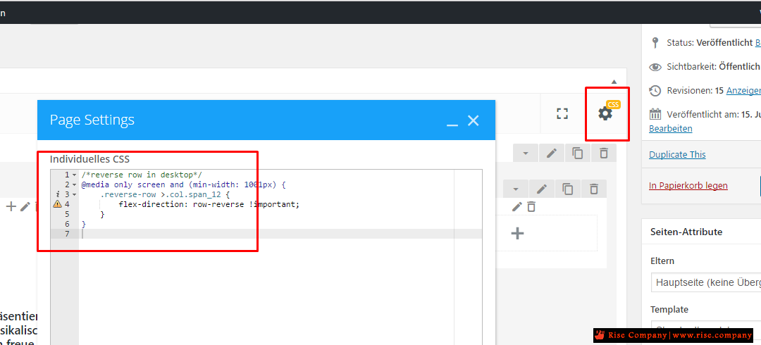
اوكود:/*reverse row in desktop*/ @media only screen and (min-width: 1001px) { .reverse-row >.col.span_12 { flex-direction: row-reverse !important; } }
اوكود:@media all and (max-width:800px){ .reverse-cols .fusion-row { display: flex; flex-flow: wrap; flex-direction: column-reverse;}}
حل اخركود:@media screen and (max-width: 800px) { .fusion-row { display: flex; flex-flow: column; } .fusion-column-last { order: 1} .fusion-column-first { order: 2} }
Duplicate the row that has the 1/4 + 3/4 containers. Set the original to display on medium and large screens only. Set the duplicate to only display on small screens and drag your 3/4 container to the left of the 1/4 container so it’s a row of 3/4 + 1/4.
+ إنشاء موضوع جديد
النتائج 1 إلى 2 من 2
مشاهدة المواضيع
-
02-03-2020, 20:56 #1Status
- Offline

- تاريخ التسجيل
- Apr 2014
- الدولة
- Egypt
- المشاركات
- 4,624
 Engineering and Technology
- معدل تقييم المستوى
- 10
 ووردبريس Wordpress عكس الترتيب على الموبايل Reverse column stacking order
------------------------------------------------------------------------
ووردبريس Wordpress عكس الترتيب على الموبايل Reverse column stacking order
------------------------------------------------------------------------
شركة رايز للهندسة و التكنولوجيا Rise Company for Engineering & Technology
------------------------------------------------------------------------
Web Hosting | Web Designing | E-Marketing
رقم # 1 فى خدمات الشركات Business Services
استضافة مواقع Web Hosting - عمل ايميل شركة Business Emails
تصميم موقع شركة Web Design - تسويق الكترونى على جوجل Google Adwords
www.rise.company | www.rise.company/emails
ملحوظة : جميع خدماتنا مخصصة للشركات فقط وغير متاحة للافراد
وليس لنا اى منتجات او صيانة نهائيا! يرجى الانتباه الى ذلك.

 رد مع اقتباس
المواضيع المتشابهه
-
ووردبريس Wordpress الاخفاء في Elementor Page Builder
بواسطة Rise Company في المنتدى قسم ووردبريس WordPressمشاركات: 0آخر مشاركة: 01-02-2020, 00:49 -
ووردبريس Wordpress اخفاء how to hide protected by reCAPTCHA
بواسطة Rise Company في المنتدى قسم ووردبريس WordPressمشاركات: 0آخر مشاركة: 22-01-2020, 11:40 -
ووردبريس Wordpress اضافة تعريب المواقع Wpml شرح التثبيت اول مرة
بواسطة Rise Company في المنتدى قسم ووردبريس WordPressمشاركات: 0آخر مشاركة: 16-11-2019, 01:33 -
اضافة تعريب / ترجمة مواقع الووردبريس Wpml Wordpress Multilingual
بواسطة Rise Company في المنتدى قسم ووردبريس WordPressمشاركات: 0آخر مشاركة: 16-11-2019, 01:06 -
ووردبريس wordpress رسائل اس ام اس smsglobal اضافة WP SMS
بواسطة Rise Company في المنتدى قسم ووردبريس WordPressمشاركات: 0آخر مشاركة: 19-09-2019, 16:22

المفضلات